Bitly
Bitly, along with QR Code Generator, offer a connections platform that incorporates URL shortening, link management and QR Code generation.
Analytics platform
Content design / content audit
Issue
Bitly felt that the analytics platform wasn’t driving enough engagement and awareness, or activating enough users.
To do
Conduct a content audit of the analytics platform.
Copy and design
Tour

Some of the copy here is a bit vague, and it took me close reading to figure out what it was saying - "Chart your data journey", "updating clicks", "stirring up scans". If we're aiming this copy at first-time visitors, we should be really spelling these ideas out.
What's the benefit we're selling here? Bringing clarity to the data, and enabling the user to draw actionable conclusions.
Recommendation
Bring your data to life
Fitness trackers. Odometers. That toothpick a Great British Baker sticks in a cake to see if it's done. They're all tools to measure progress towards a goal.
Data is a powerful tool to measure your connections’ progress. Our new Analytics page lets you build a dashboard showing the data that’s most important to you.
Whether you’re measuring clicks for a monthly report, or tracking scans for a presentation, our range of graphs, scorecard and charts will help you understand what your data is really telling you.
[Explore on your own]
[Take the 3-step tour]


I think the user benefit to these features can be more clearly spelled out.
Recommendations
1 of 3
Select your dates
Focus on data from a specific time period by selecting dates here.
[Next]
2 of 3
Filter your links
At first, your dashboard will show data for all your links and QR Codes. You can also focus on the links and QR Codes you want to keep a close eye on.
[Next]
3 of 3
Personalize your dashboard with modules
Click here to easily add line graphs, bar charts, scorecards, and more, and start bringing your data to life!
[Close]
User hasn’t made any links yet

I think this copy would be more appropriate if the user doesn't have any data to track yet, but has made links.
The "Learn more" button doesn't take the user anywhere specific. We can cut it and just leave the other links.
Recommendation
You haven't created any links or QR Codes ... yet
Create and share links, QR Codes, or a Link-in-bio to start tracking how your audience engages.
User hasn’t had any clicks yet

The visual hierarchy isn't immediately clear here. The empty space and various text elements with similar copy and different alignments mean the eye tends to drift around the screen looking for somewhere to land.
If the user doesn't have any clicks, we don't need to tell them four times on the same screen.
Recommendation

You don't have any clicks or scans ... yet
Here are some tips to drive engagement.
Dashboard

The repetition of "Clicks + scans" in these makes the modules blend together. The user needs to pay extra attention to distinguish what each one is for.
Recommendation

A single “Clicks and scans” header, with the subheaders getting straight to what makes them distinct.
Add module
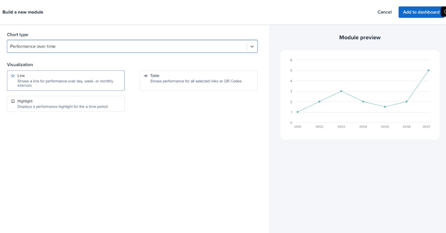
Chart type
I feel that this isn't distinct enough from "Visualization", as "chart types" could refer to bar graphs, line graphs etc. Could we refer to data or metrics here? We could add a subheader here, there's plenty of room on this screen.
Visualization
This could be more personable. Maybe another header / subheader combo?
The visualization options could be stacked in order to make the preview section of the screen bigger.
Recommendation
